Context
The Life Sciences industry is understandably highly regulated, with clinical studies that can last many years (sometimes 10+ years).
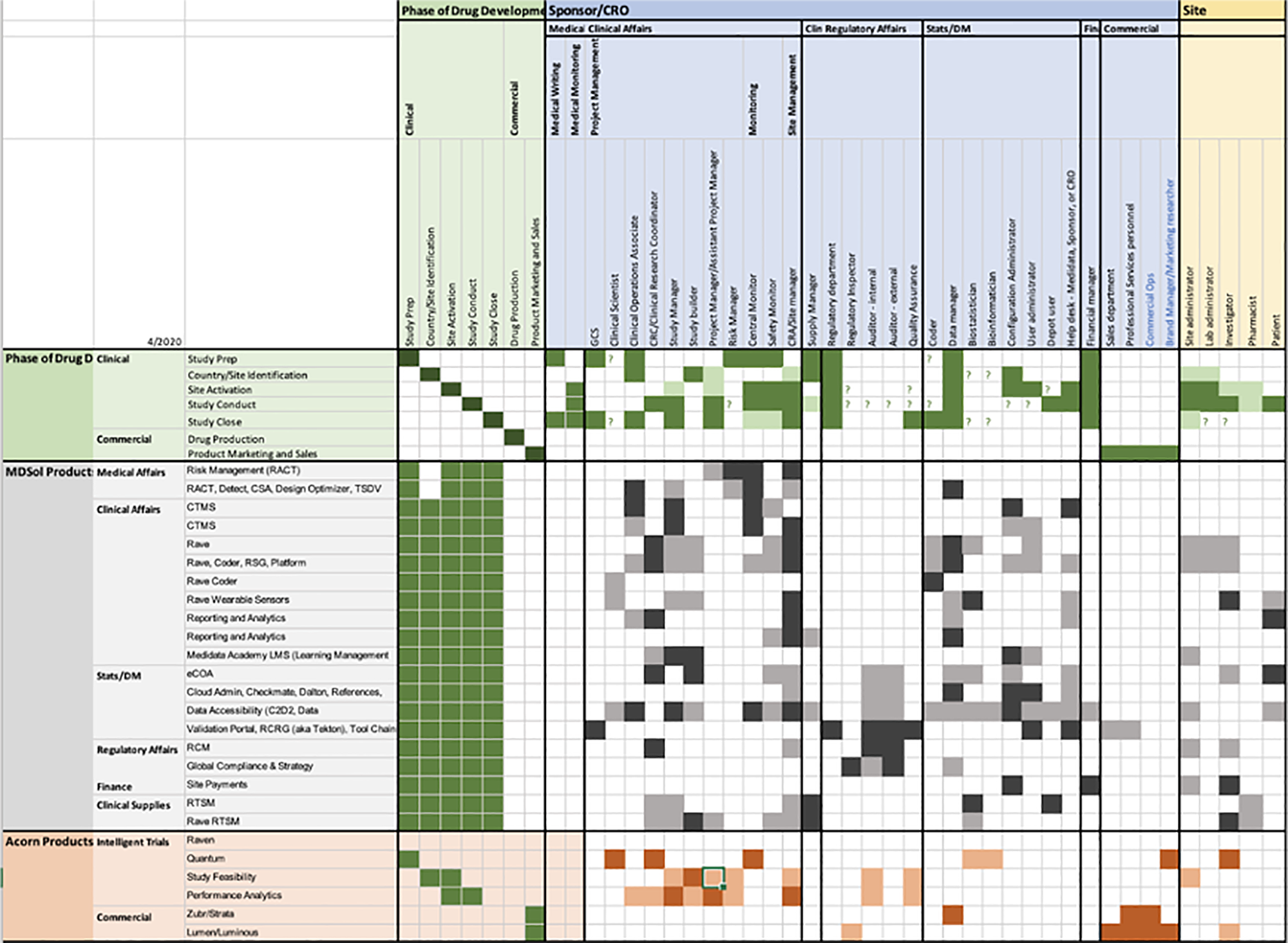
In the first phase (years 2000 – 2015) of the digital transformation of the sector, the customers were ok with selecting multiple providers, each of them offering specific products, to cover all their digital needs. That caused the proliferation of highly specialised solutions which often suffered from a siloed product development, where every product had its own roadmap to follow and was often ending up being disconnected, in terms of both data flow and user experience, from the rest of the products. This “silo effect”, plus a trend to productise solutions because easier to manage internally and easier to monetise from externally, together with the objective historical complexity of the Clinical trials industry, are some of the reasons why Medidata ended up, over the years, with a portfolio of over 30 products.
The industry finally realised how inefficient and costly this approach was and wanted to consolidate all the operations with providers that could be a one-stop-shop for all the needed digital services.
Enter the Medidata RAVE Cloud platform which, over the most recent years, has seen the redesign and convergence of old legacy Medidata apps into a more modern and cohesive SAAS enterprise solution platform. This process requires time and resources and it is still ongoing.
In the meantime, new competitors appeared on the market and, with the benefit of starting from scratch, could build lighter solutions with a new holistic and agile approach. One of the aspects that a few competitors could offer was a performance dashboard representing the main clinical operations needed to conduct the clinical studies.
This is when Sales came to Product and Design asking for a CTMS (Clinical Trial Management System) Dashboard solution in order to win back contracts.
Timescale
An MVP for the next quarter release was needed because of the sales losses. We needed to show our clients that we would soon have a dashboard feature as well as our competitors.
Problem
Obviously, being designers, we didn’t go into execution mode straight away, as we wanted first to understand which were the real user needs that we were trying to address. After reviewing the available market research, analysing the Pendo’s reports, talking to our SMEs (Subject Matter Experts), interviewing several users from our customers’ pool and a few external users, we got to the conclusion that the problem was twofold:
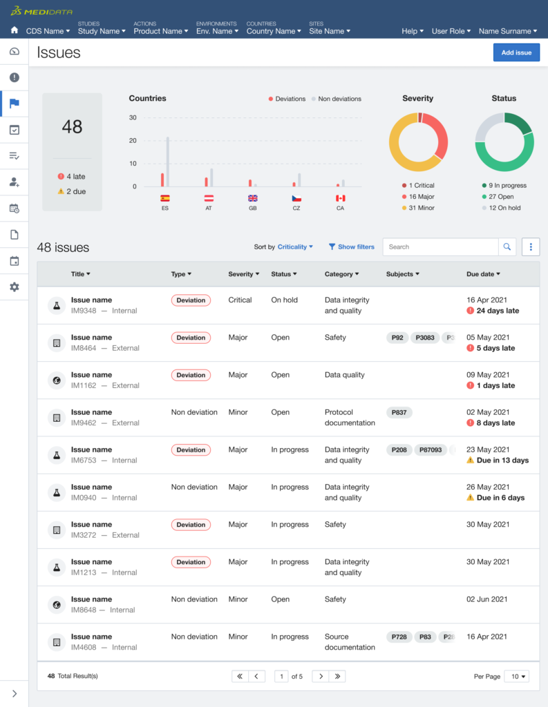
- first, it was around the efficiency of the Medidata navigation since users had to navigate multiple levels in order to find the relevant information across different products.
- secondly, it was about the users need for a clear and unique viewpoint where timely understanding what items to act on, or at least being aware of, in order to unblock the operations and keep the study flowing smoothly and steadily.
Experiments
We started with a small experiment and tested with users: displaying visual data at the product level, trying to understand what the user need was (deeper, more detailed, considering the trend in time rather than what’s urgent).
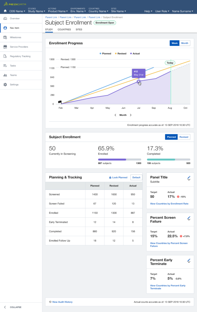
Next, we expanded the scope of the experiment targeting users who match the same persona but use multiple products, focusing on what urgent information had to be surfaced across the board in order to enable a quick response.
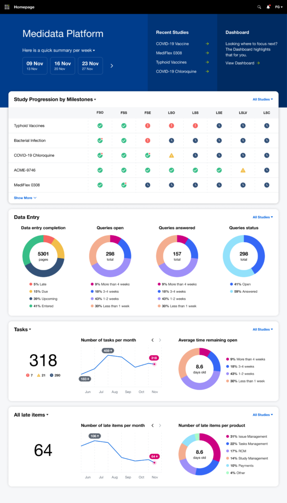
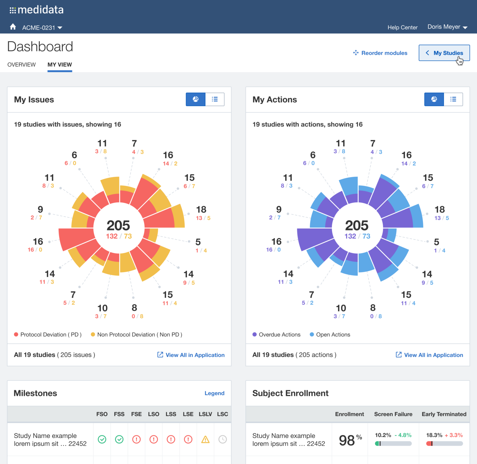
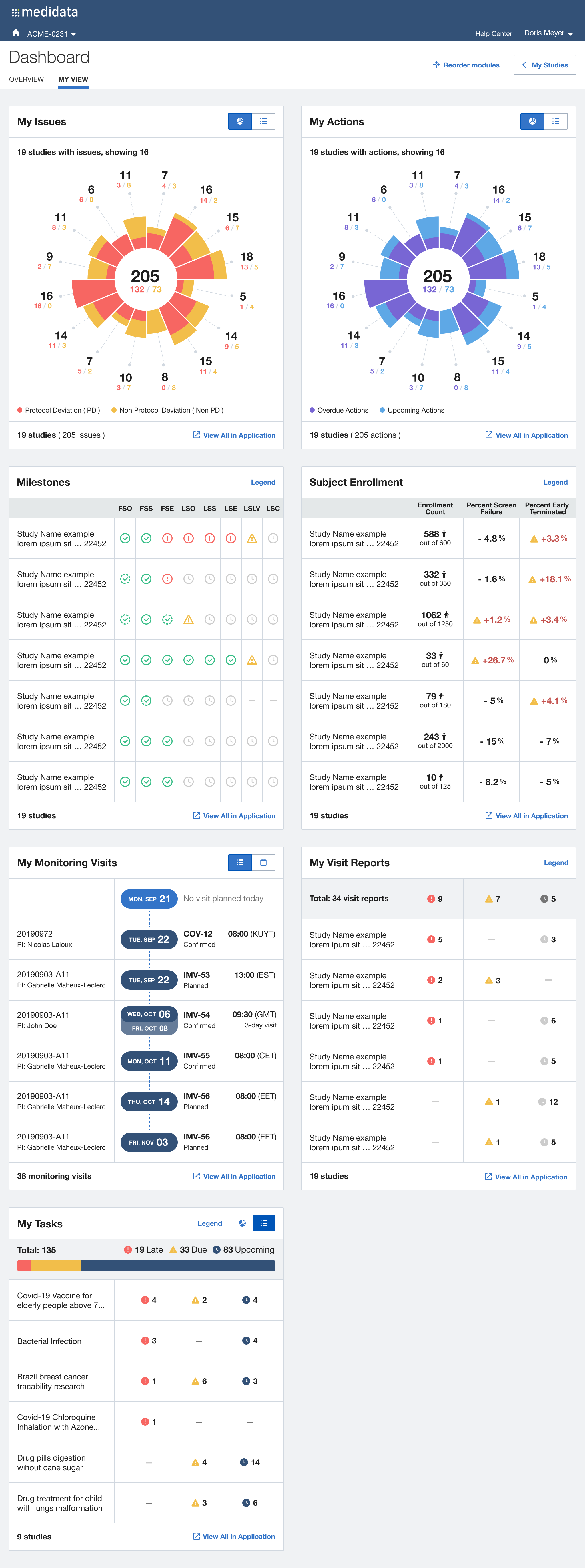
After multiple rounds of testing, we settle to a version made of two main views, the Overview for the Study Manager persona, and the My View for the Clinical Research Associate persona: each with different groups of widgets and a different focus (general vs user assigned).
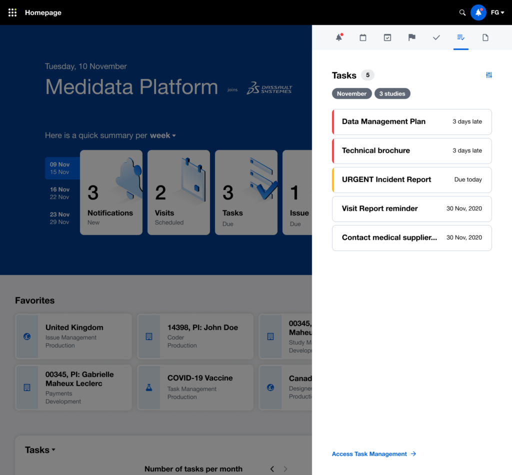
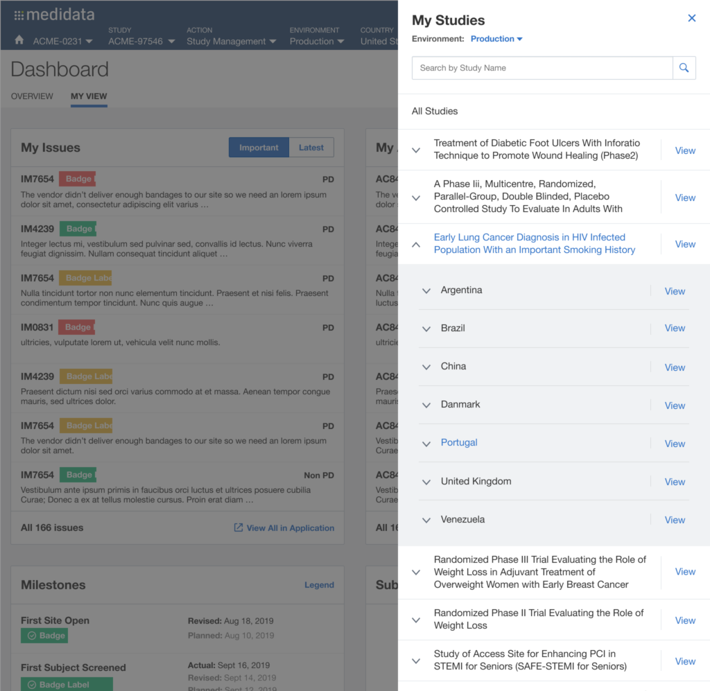
The issue of Navigation was solved with My Studies, a sliding panel where the users can access, browse and search for all their studies, choosing the appropriate level of data observation (Client Division Scheme, Study Environment, Study Environment Country, Study Environment Site).
Desired Outcome
Beyond offering a quick and effective view on the status of the study clinical operations, we understood that it was also an opportunity for Medidata to reinforce a user habit: make the users want to access the platform on a daily basis (instead of once or twice a week or even less), acknowledge the progress made, solve issues more quickly and eventually drive platform adoption, increase platform consumption and drive user retention through user satisfaction.
My Role
Throughout the project, I engaged at a different level and time with multiple Senior stakeholders in Product Management, Engineering, Quality Assurance, Professional Services, Sales and various Customers, from the initial discovery phase through the design iterations, user testing and implementation up to the adoption and beyond.
I ideate and led, or co-led with other designers, workshops, coordinate the various product designers involved in the design execution, planned the research, invited stakeholders from different functions to attend interviews and usability testing sessions, found tactical compromises due to technical or time constraints (like pushing for prioritising specific widgets and views based on user feedback rather than on the SMEs opinions) but, most of the time, it was about communicating the progress of the project and keep all the involved parts on the same page.
The dashboard was a cross-product, cross-functional effort that required to find a common ground around the urgency of information that needed to be served to different types of personas, operating with different roles and different levels of access to different products, working for different types and sizes of organisations. And deal with potentially huge data bottlenecks that could cripple the overall performance and experience.
Tools Used
We have been using whiteboards and post it, when in presence, or Mural, when remote, for the initial discovery phase, UserTesting.com for the interviews and for the moderated usability sessions, Axure Pro for the initial wireframes and clickable prototypes, transitioning from Sketch to Figma for the final deliverables for the developers.
Measuring the KPIs
After a one-year trial with two enterprise Pharmaceutical groups and three medium-size CROs (Clinical Research Organisations, a sort of middle man between Pharmas and Clinical Sites) we saw:
- +30% daily returning users to the dashboard instead of going to individual products
- +20% / 25% of cross-product consumption for products linked to the dashboard
- -35% average time needed to resolve issues.
- 70% win-back rate after the trial expired
- not anymore a blocker for Sales.
What’s Next?
Among various additional learnings, we also understood that:
- The Dashboard approach was still not ideal since it was a separate product that was competing with other products and needed to be willingly selected by the user.
- The multi-widget approach could have been adopted across the CTMS products and benefit their overview pages.
- We could have extended this approach to the rest of the platform potentially integrating with, or even replacing, iMedidata, the platform homepage.
Since the first MVP, we kept fine-tuning the existing widgets, adding new ones from more Products always keeping in mind the different personas’ users journeys.
As expected, the dashboard approach has informed and inspired new other initiatives: the CTMS transformation initiative and the new iMedidata platform homepage and the new global navigation.
Evolution is never linear: started as an experiment to address
a “Sales emergency”, the Dashboard approach has become a Product on its own and now is branching out into new high potential directions.